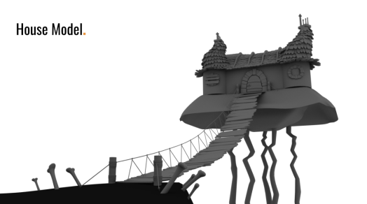
Scene 4 – Layout compositing and Lighting

MODELLING THE HOUSE 

For scene 4, one of the largest assets in our whole short, The house needs to be created. For this process, I began by using Natasha’s concept art as my reference point. As you can see the main features that were important to capture were

  • The ‘dragon scale-like’ roof tiles
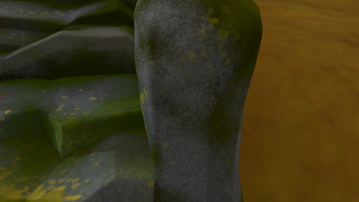
  • The stone work on the walls
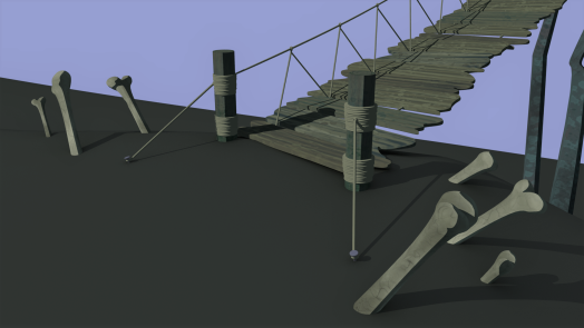
  • Rickety looking ropebridge
  • bones around the edge of the cliff
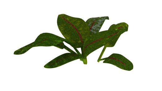
  • Overhanging hay

Capture8

(Natasha Crowley concept Art)

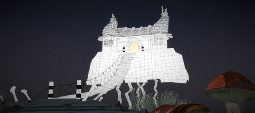
I began by starting on the roof tiles,

house_12

Something’s not right…

Initially, when I started on this roof I had made them too tall making the slates feel too plentiful. To resolve this I simply cut the towers in half…

house_23

I think went in and using Box modelling within Maya simply modelled out the other elements of the house. I decided that the grass overhang would be best as a texture added onto planes.

Capture9

Natasha’s task this week was then to light render and composite this in nuke. She was able to get some really nice results. Overall the results seem very promising.

Capture10Capture11

(Natasha Crowley)

TEXTURING

All of the textures for the house were completed in substance. Once our Cel shader plugin was added we had a really nice effect especially for the tiles. I ended up just using a matt constant on the roof tiles as a detailed texture lost the silhouette of them.

layout_84.PNGlayout_87.PNGlayout_88.PNG

(Overhanging straw, illustrated by Natasha Crowley)

(House normal, colour and roughness map for the walls)


THE FINISHED MODEL

Once the Model was done it was then onto creating textures for the scene.  Here you can see the house model in the scene set up I created. Once lit and with the sky backdrop, it started to all come together.

housev1housev2


SCENE 4 LAYOUT, COMPOSITION AND LIGHTING


I began scene 4 by looking at our roughed out plan of it for the animatic


(Rough animatic shots for scene 1)

I then went in with MASH and placed the assets in the scene, creating the compositions for the different shots. I was able to use the proxy animations for this.

scene 4 mash

You can see where a Placer system would come in handy as this scene has 100s of tall grass strands and items of foliage. This meant that I was able to quickly set dress the scene and keep the scene optimised for ease of use.


Lighting and Composition

Next you can see my finalised test renders for how that scene is going to be rendered. This process involves lighting and getting the composition of each shot correct.  For this scene I wanted to create an omnious and eerie midnight feel, so I chose dark purples and greens to emulate ‘halloween’ style colouration.

scene4v29scene4v23scene4v11scene4v24


Scene 1 Layout – over coming issues

My process with Layout

My role with Layouts is to give everyone animating a proxy layout that should be significantly lighter than the real layout, this in theory should give them a sense of where the character should be in the scene. This should work well… In theory.


THE ISSUE

The first problem I found when bringing in the animation of the characters was that Nami’s animation simply sailed through trees, got lost in every shot and was on the very edge of the huge map. This meant that none of proxy layout had been turned on during animation. This was a huge headache and took around a week to correct overall. My task was to-

  • Prevent Nami from colliding with the many objects in the scene
  • Prevent Namis’ sihouette from getting lost against the environment
  • Move the entire map to accomadate for Nami’s animation ( get her into the center)

This was a huge and very slow job and left me feeling increadibly frustrated. Animation corrections for this scene were also pretty numerous as cameras had to be moved and altered so that compositions could work.

Below you can see some of the problems with Nami’s Sihouette getting lost against the trees and my attempt to correct it.


BEFORE

renders_tato_36

AFTERrenders_tato_77

You will also notice that because certain shots had been created in the animation without the environment in mind, the composition simply failed to work. Below is another example of this.


BEFORE

renders_tato_65

AFTERrenders_tato_71

BEFORE

renders_tato_42

AFTERrenders_tato_67


LIGHTING EACH SHOT

It was part of my job to light all the shots in many of the scenes. Here are the lighting setups for each of these shots.


renders_tato_76renders_tato_77renders_tato_78renders_tato_58renders_tato_72renders_tato_75renders_tato_74


Learning Mash – Creating Scene 2

Firstly we knew we wanted to use MASH for placing our assets around the scene as placing by hand seemed overly time consuming. The MASH application seemed fast and efficent and would considerably speed up the process of placing our many assets. In our short we have 7 different scenes. These are as follows

  • scene 1 (FOREST)
  • scene 2 (FOREST)
  • scene 3 (DARKER FOREST)
  • scene 4 (HOUSE BESIDE AN EERIR FOREST)
  • scene 5 (HOUSE INTERIOR)
  • scene 6 (INTERIOR OF THROAT)
  • scene 7 (BESIDE HOUSE)


RESEARCHING MASH TUTORIALS ON PLACER AND DISTRIBUTION NODES

As you can see many of these scenes are forest-based meaning there will be a huge quantity of shrubs plants and rocks littering the ground, not to mention the trees. Therefore MASH would be a tremendously helpful system. Below is an example of tutorials I followed in order to get my head around MASH for Maya 2017.


Below is a very typical example of what my MASH setup is for pretty much every scene. Generally I use it fro any enviorment asset that will need created on mass, fro example trees, rocks, mushrooms and the large variety of plants created. These can all be placed in a MASH placer node (seen on the right hand side). I usually create –

  • A placer Node
  • A distrubte node

for each object. If we have say, four different types of rocks, then I can enter all four into the same node, and within the settings choose the frequency of the placement, the scale and rotation and randomize them. As well as this there are also tools that allow me to edit them once placed. Herein lies the problem I have with MASH.

mash 02

ISSUES WITH MASH

While MASH is clearly a very handy and powerful tool I found that the lack of ability to precisely edit my assets was a big problem. If I have 100 nettles clustered together, it is virtually impossible to select out a few individuals. This is a problem when it comes to characters colliding with objects in a scene.

MAKING PROXIES FOR THE ASSETS

Natasha and myself created a asset list that would allow us to go through when

  • Proxies were made
  • Assets were modelled
  • Assets were UVed
  • Assets were Textured
  • Assets were rigged (If needed)

planning asset

These would then be Checked off with orange when in progress and green when finalised. Me and Natasha divided up the assets between us, however as the workload progressed and Natasha ended up moving on to animation I ended up Texturing and modelling a few of her assets.

PROXIES INTO MASH

The first scene that I started laying out in MASH was scene 2, in which Puca is introduced. He appears ontop of some stone steps and so I threw together of rough model of those and the ground first to help find the sense of space. I then started blocking in where different plants and assets could go to help fill the scene. I had a rough idea of where the different cameras would be based off the animatic and storyboards.

layout_03

ADDING TEXTURES TO GET A SENSE OF COLOUR

Below you can see a rough texture on all of the proxy models. These were added to give a very early feel for what the scene could be like. I quickly realised that green plants felt too ordinary for such a bonkers fantastical world.


layout_14.PNG

I then referred back to Natasha’s initial concept art which featured a muted pink hue. I took this and sorcha’s colour script and used them in an effort to colour the scene. Notice below the first colour block on the chart. These reds and oranges were what we wanted.

colour_script_with_notes.png

(Sorcha’s colourscript)

layout_73.PNGlayout_78.PNGlayout_81.PNG

TEXTURING THE STEPS AND OTHER ASSETS

I then used Substance Painter to texture some of the assets in the scene, below you can see some up close shots of the steps texture. I drew up some celtic animal designs and scattered them over the stone work.


layout_40.PNG


When the CEL Shader was added I sadly had to lose some of this normal Map detailing but it was for the best in the long run.

layout_95.PNG

I also created a variety of other assets for this scene, however these designs are prior to when we decided to use a cel shader. The cel shader answered of problem of the designs being too realistic and not as illustrative.

layout_55.PNGlayout_60.PNGlayout_62.PNGlayout_65.PNG


Tato – texturing and prop modelling

Andrew’s Model

Andrew passed me along a really lovely model for Tato so I was able to just jump straight in with the texturing.

Character Research

Of course, some potato research was necessary and so I created a reference board of spuds as well as going through out pinterest board of different characters that we felt captured the essence of what Tato should be like.


Taking him into substance

tato2

The initial potato design that I painted up in substance was upon review, very detailed and seemed too green in tone. Andrew showed me his previous character designs in which the character was much brighter and was much more visually appealing.

Feedback (Not cartoony enough)


The strong yellow proved to be much more aesthetically pleasing and when compared the old texture looked ghoulish! I carefull drew on some little dents and blemishes onto his skin, and took care to keep some darker, flakey looking patches like on real potatos. By now I knew that we would be using the cel shader and so avoided spending too much more time on the normal maps. We had spoken about each character having blue celtic warpaint, to show their unity with eachother and their ferocitity as a team. For Tato, I didn;t want to place this somewhere that would effect the eyes and so my choices were either forehead or below the chin. Puca also has his blue paint on his chin so it felt appropriate.

tato1

After this I quickly rendered him out in his new style. It was wonderful to see him start to come to life and all our hard work paying off.

tato6.PNG


The Props

For the characters Props I knew it was my task to both model and texture them. This meant that I had to plan out how they were going to look, based off andrew’s previous designs.

THE SHIELD

As Tato is a very small character I thought it would be funny if the object he uses as a shield is a little button. The juxtaposition of this should hopefully be funny. I kept the celtic blue colour theme going as well, with a nice swirl on the material.

THE SASH AND SATCHEL

Tato’s little bag is supposed to look like it was specially made for him. It is based of similarly styled medieval satchels and should fit into our fantasy time period nicely.

THE SWORD

Tato’s sword is a little piece of metal attached to two small sticks. The handmade feel is something I really wanted to capture for this design.

tato19.PNGtato17.PNGtato18.PNG

With CEL Shader plugin

tato swordtatopin

The introduction of the Cel Shader

The problem with our original look

Artistically we knew we wanted a style that would look different from what we had. We had had trouble settling on the look and had kept going back and forth about whether a cel shader was a good option for us. My textures were proving a problem too, as early on in the texturing process I had been creating very realistic and detailed textures and shaders and this was not something we had wanted to do. My introduction to substance painter had caused this, due to its wide variety of options for realistic textures.  Natasha and me sat down and went through examples of concept art and tried to decided what level of ‘painterly effect’ we wanted to achieve. In the end we discovered a wonderful plugin that would allow for each of our textures to be controlled by a ramp. This ramp’s shadow and highlight colours could be altered and the overall hue of the scene changed.


PROS AND CONS OF THE SHADER

The pros of the shader were plentiful and once my initial experiments were carried out it was apparent that it was something that we should move foward with. The graphic style was quite unique and would help set the short apart. However as we progressed with it there definatley were some downsides to working this way.

layout_81.PNG

(My initial CEL shader test)

PROS

  • Stands out and sets us apart.
  • Easy to light (1 directional light for environment, one for characters)
  • Simple to alter
  • Can look 2D

CONS

  • The common ramp has to be hooked up in the node editor to every single texture in that scene. So if I have a scene with say 100 assets, then each of those will have to be hooked up manually.
  • I made the stupid mistake of deleting an object whose common ramp was controlling a scene. This meant that I had to go back to an older file version in which they were hooked up. A relativity easy mistake to make when using this process.

Below you can see my common ramp set up for 1 scene. I had to create this system 6 times for all the scenes I worked on. You can see the environment common ramp (The largest) with each little node attached. Nami, Puca, Tato and the strangeling’s common ramps are just below that in the image and then are zoomed in on in the image below that.

nodetreeenodetreee2

(Huge common ramp system I had to set up for each scene)

Below you can see how the cel shader effected the character textures once attached. I was dismayed that all my normal maps for Puca would no longer be used, however It meant I could go in and make sure that he was looking crisp. He definatley suited the cel shader style so I couldn’t worry too much. It was a similar process for the strangeling.

PUCA

charactercelshade_11charactercelshade_15

TATO

charactercelshade_07charactercelshade_08

STRANGELING

charactercelshade_02charactercelshade_03

ASSET CREATION

Below are a selection of the assets I created for each scene. As I was lead modeller there was a very large ammount to create and so I had to work my way through them as quickly as possible. To carry out this I acknowledged whether assets would be seem closely or from a distance, and paid closer attention to assets that would be in direct sight such as the staff, plants and red mushrooms. The models all looked good with the shader and seemed to work well overall in the scenes.


Scene 7 – The endscene

Responsibilities for scene 7

  • Animation
  • Layout and environment creation
  • asset modelling
  • asset texturing
  • camera
  • lighting

Animation

I am not a massively experienced animator however considering the amount of animation we needed to do for this project I happily said that I would take on as much as necessary while balancing creating the environments for the scenes. Scene 7 was one of the scenes I was required to animate. I had to work fairly quickly and didn’t have as much time on it as I would have liked as, while I was working on it I was also creating the environment for scenes 2 and 4. so finding time for both was tricky.

I think I did an ok job but it’s not really my best work, nor is it what I do.


Playblast –


Rendered (PRE COMPOSITION) – 


Layout, composition for scene 7

So for scene 7 I was able to use the same environment as the one I had created for scene 4 in which the character discover the house. I decided to use the forest around the front of the house as my location for the scene. ( Where the green circle is below). I couldn’t ust jump straight in however and had to move around assets and set up a new stage for each shot to look good. I found somewhere where they could be framed and the illusion of lush forest could be preserved.


scene 4


COMPOSITION

The below shots illustrate how I worked out where all my cameras would be. I based these off our storyboards and rough animatic and so was able to get a pretty good idea of how each one would look.


Lighting for scene 7

Next step was to light scene 7, meaning that I would need to refer back to our colour script. As it’s the end of the film we want the hues to be blues and greens, much more subdued after the previous red tones. Its the winding down section of the story. The blue/green should symbolise the peace.


Puca Sculpt fix

Retopo

Puca has been reptopologized using a mix of zremesh and manual in maya. The original zbrush sculpt’s arms were far too close in on his chest and so the new model had to have the arms brought out the ways in order to give him full mobility and good shoulder rotation.

The greyscale – 

This slideshow requires JavaScript.

The Wireframe – 

It was apparent quite quickly however than in the retopo process I had lost a lot of the character and shape from the model. The sharp edges and flat surfaces were gone.

Fixing The model

I brought the retopologized model back into zbrush in order to go over the surfaces and try and get some of the nice angles back. This process was a lot of jumping between maya and zbrush in order to achieve a natural looking model.

puca resculpt 2puca resculpt 3

In order to help me I drew directly onto photos of the model exactly where i wanted my edges to be. Here are examples of this

This was the result of this work in zbrush –

pucaresculpt11

After doing this I looked at the silhouette of the model and made adjustments. Fixing the positioning of the horns and other features to give a better silhouette.


This slideshow requires JavaScript.

I also compared my new model to the initial sculpt and drew on what edges I wanted to get back.

puca lines

After some work here were the improvements on the Arms…


too flat


The art of Shapeshifting…

Shapeshifting

As my interests have drawn me toward the creature side of things I have started looking into how we could potentially have a shapeshift within our animation.  This really beautiful little animation demonstrates the ‘breaking’ of the rig to extreme deformations and overlaps to achieve a melding effect.

https://vimeo.com/210022054


Other Examples…

In this awesome talk about creature animation the animator Jalil Sadool talks about different challenges in his career. While being an exceptionally helpful and interesting watch, I also saw an animation he had done of a game called Dauntless of a creature called a shriek. The shriek is an owl like creature that transforms its wings to become a quadruped. The animation is really fluid and it would be an interesting way to carry out Puca’s shapeshifting.


Some other points Sadool mentions are that while animating, there are cheats that you can use in order to make a shot work. For example a creature landing quickly and stoping abruptly. While this may not look right from all angles you can play with the animation and make it work for that one camera, by exaggerating other movements to distract the audience. This is something we should  keep in mind when it comes to planning our shots.


My attempt at a shapeshift animation –

While the animation itself is awful it was more a test to actually see what the possibility of a shape shift could be like. Animatic permitting we may remove any shapeshifts in future.

Pitch Presentation – Technical

Back to Maya

I’ve just installed maya 2017 and to be honest it’s going to be a bit of a challenge for me to get back into Maya this year, as I’ve spent the last year learning C4D. I’m a little out of practice. I really want to get into modelling and texturing again this year and I can’t wait to start on our characters. While of placement I did a lot of lighting work too so I feel like that will be very helpful.

Project Technical Challenges

We’re going to have a lot of challenges on our project. Hell, one of our characters is a shapeshifter. Jenny and Alec both showed us this really gorgeous shapeshifting animation created using the Body mechanics rigs. Scaling the model hides the blend. It’s definatley something to keep in mind for our transformations however we may lean towards create the effect in post.


Another issue is that Puca is also going to have a long snout, so I’ve been looking at how we could potentially set that up. I found this really awesome video by the Mill, for an advert called ‘Third Wheel. The facial rig set up for the bear is beautiful and definatley something to look at for Puca.

https://vimeo.com/234706262

http://www.cgsociety.org/news/article/3555/behind-the-scenes-100-cgi-bear-for-third-wheel-