EOYS Prep

Overall my experience of the set up for the end of year show has been very positive. A group of class members were able to quickly and efficiently set up and organise the room and we are all fairly happy with the results. We were however somewhat annoyed with the lack of help from a large portion of the class, many of whom left it until the very end to come in and set up and took no part in any of the cleaning, tidying or organising the rest of us had to do.


Building the boards/setting up that tables

eoys 01

I helped take the boards from the store and set them up and also to organise the tables around the room. We went for a double board between two tables much like graphic design’s usual layout.

Arranging our table space


For our space I had not really liked how I had initially planned to lay it out with a main screen in the middle and so instead we decided to play around with the tables and see how we could make the wall/table ratio fair. In the end we decided that an end table jutting out sideways would be a good addition as we could add our final year film to it.

Laying out the display

eoys 05

eoys 06

We then got a measuring tape and worked out all of the spacing between the benches and worked out how much room each of us would have.


  • wall length – 436cm
  • wall height – 253cm
  • top of mac to wall – 133cm
  • individual space – 87.3 cm
  • length of big frame – 25 inch
  • length of big frame – 63.5 cm


Painting the walls

eoys 12

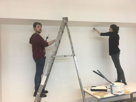
We painted! Here we also helped out We are Belfast’s team paint their wall too.
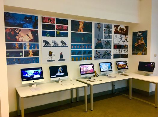
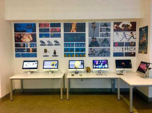
Printing the work


We went to B and Q to try and find something that we could mount our prints on but it all came out way too thick as seen above.

kerry template

We decided for our boards that we would simplify things by getting it printed on one big board each, that way we wouldn’t be tinkering trying to get all of our work even or aligned. It worked very well.

eoys 20

The poster

eoys 22

Card and CV


Showreel

https://vimeo.com/268661765


Portfolio/ Art station

https://www.artstation.com/kerrymccormick


Tidying desk space

eoys 24eoys 25

The set up

33715006_10216250875891753_8758420493960216576_n33817384_10216250875811751_2540528122575454208_n

Still to come

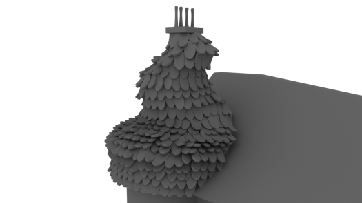
*3d prints of puca and nami

*cardboard cut out of nami puca and tato

*3D wood cut of of ‘NAMI THE LAST WITCH’ logo for above work

*Our pictures, names and role at the left side pillar

End of project review

I can’t believe its the end of the project already. The year has flown past completely and I will be really sad to see this come to an end. Team wise I will miss working with Sorcha, Andrew, Matty and Natasha immensely. They are are exceptional, hardworking team members and I thank them all for the amazing year! We chose our team well as all of our very different strengths helped carry the project. Andrew’s technical abilities, Natasha’s amazing eye for look development, Matty’s animation, sorcha’s  management nd editing skills and my own character and environment creation meant that we were able to get the job done. We’re all super happy with the outcome.

While we are all drained from working flat out on it, I think all of us would be happy to either keep working on it or do another episode. That is something I am really proud of as I had been worrying about us becoming tired of the same project after a years work. Its wonderful to know that we are all still so enthusiastic about it. We all love our characters and our world that we’ve built and will miss it greatly. It has been brilliant to see the project bloom from a basic concept about a girl and a irish fantasy create to being an actual film with characters that feel real to us.

Thank you to Alec and Mike for your guidance!

Thanks to my team!

thats all folksv3

Scene 5 – house interior

Responsibilities

For this scene I was tasked with

  • Designing the layout of the room.
  • Creating initial proxy models of the room for animation purposes.
  • Modelling the assets in the scene (Natasha helped out with the straw, cobwebs and wall texture)
  • Texturing assets in the scene
  • Lighting
  • Camera
  • Rendering


Working out compositions

Scene five takes place within the inside of the house. That means that for this scene it would be necessary to design the layout. So I had to go through the animatic, work out what our camera positions would be and what compositions would work for each shot. I then went through and worked out what assets were necessary. Natasha had made a bit of a start on the house interior, texturing the walls and creating the roof base.

Creating the look

I looked at many examples of barns and taverns from Skyrim in order to get a feel for how it should look. Many of the examples included wooden beams and hay covering the floor and so this was something I included. As our house is supposed to look abandoned I added mushroom and foliage around the place and scattered some of the floor boards. Alec suggested adding a second level to the room in order to give it more depth and so I created a ladder with a small platform and placed it in a location in the room where it could be seen clearly. I had actually created a table and chair with many items sitting on it however it was ruining some shots when included so I had to remove it in order to preserve the composition. Natasha created many cobwebs in order to litter round the room too and they were all very effective. I also figured that i could include some of the tall grass I had created in the other scene and have it growing up through the floor boards in order to contribute to that disheveled look.

Below you can see some of my work in progresses for lighting and getting the scene ready to be combined with the animation.

HOUSEINSIDELAYOUT_V2HOUSEINSIDELAYOUT_V4

HOUSEINSIDELAYOUT_V8HOUSEINSIDELAYOUT_V9


Recycling Assets

Below are a couple of renders of some of the props I created for this scene. I figured that reusing would be useful here and So for the ram skull I was able to use it on the cauldron as well as creating new horns and making a goat skull and a stag skull, each of which can be seen in the room. this was a quick and productive way of making new assets.

(ABOVE – Some of my RAW renders for this scene.)


Pablo Munzo Gomez – Research

I really adore the work of this artist Pablo Munzo Gomez, a fantastic Character artist fro Melbourne Australia.

pablo 1.PNG

HARD SURFACE MODELLING IN ZBRUSH

Here’s a little character Pablo created while Beta testing Zbrush 2018. He has such a beautiful design and is sculpted terrifically, however my favorite thing about this artist’s work is how he creates his textures. They are gorgeous and display a wonderful level of tactility. Pablo uses keyshot in order to render his work. His work is textured in polypaint and I am really amazed at the level of quality and detail achieved. While I don’t really model many hard surface character’s, this work makes me want to try!

pablo 2pablo 3

 I used this project to test the new features and find how they can fit into my workflow, so with this robot, I used pretty much all the new major features to model it, detail it and set it up for render.

– Pablo Munzo Gomez


ASKING THE ARTIST

I spoke to him about his work asking him about his process for his latest sculpt of a little goat on a hill. He pointed me in the direction of his timelapse that he created for it. Texture wise it feels to me like a oxide paint on ceramic. Its beautiful and something I would love to have a go at emulating to see if I can.

pablo 6

This piece named ‘warrior’ by Pablo, was created using zbrush and the render taken into photoshop. It is an excellent example of amazing texture work. The paint on the man’s body seems so real. I am going to have to really rethink my aversion to polypaint and give it another try.

PORTFOLIO

REEL –

https://vimeo.com/268661765


POSTERV11

(PUCA – Design, modelling and texturing)

TURNTABLE_TATO.0021

https://vimeo.com/268285833

(TATO – Character textures and Prop modelling and texturing)

STRANGELING

https://vimeo.com/268285756

(STRANGELING – Modelling and texturing)

wolf_01wolf_03

(Wolf sculpt/model for Anna McCraith and Callum Luckwell’s project)

housev1

(HOUSE AND ASSET- Modelling and texturing, lighting, composition)

movie 01

(Scene – LAYOUT and composition + character creation)

movie 04

(Scene – Puca character creation + steps, mushroom, grass modelling and texturing + layout)

movie 05

(Scene – Puca character creation + layout, light and composition + asset creation)

movie 06

(Scene – Puca character creation + layout, light and composition + asset creation)

movie 07

(Scene – Puca character creation + layout, light and composition + asset creation)

movie 08

(Scene – Puca and strangeling character creation + layout, light and composition + interior house modelling and texturing )

movie 09

(Scene – strangeling character creation + layout, light and composition + interior house modelling and texturing )

movie 10

(Scene – Puca character creation + layout, light and composition + asset modelling and texturing )

Scene 4 – Layout compositing and Lighting

MODELLING THE HOUSE 

For scene 4, one of the largest assets in our whole short, The house needs to be created. For this process, I began by using Natasha’s concept art as my reference point. As you can see the main features that were important to capture were

  • The ‘dragon scale-like’ roof tiles
  • The stone work on the walls
  • Rickety looking ropebridge
  • bones around the edge of the cliff
  • Overhanging hay

Capture8

(Natasha Crowley concept Art)

I began by starting on the roof tiles,

house_12

Something’s not right…

Initially, when I started on this roof I had made them too tall making the slates feel too plentiful. To resolve this I simply cut the towers in half…

house_23

I think went in and using Box modelling within Maya simply modelled out the other elements of the house. I decided that the grass overhang would be best as a texture added onto planes.

Capture9

Natasha’s task this week was then to light render and composite this in nuke. She was able to get some really nice results. Overall the results seem very promising.

Capture10Capture11

(Natasha Crowley)

TEXTURING

All of the textures for the house were completed in substance. Once our Cel shader plugin was added we had a really nice effect especially for the tiles. I ended up just using a matt constant on the roof tiles as a detailed texture lost the silhouette of them.

layout_84.PNGlayout_87.PNGlayout_88.PNG

(Overhanging straw, illustrated by Natasha Crowley)

(House normal, colour and roughness map for the walls)


THE FINISHED MODEL

Once the Model was done it was then onto creating textures for the scene.  Here you can see the house model in the scene set up I created. Once lit and with the sky backdrop, it started to all come together.

housev1housev2


SCENE 4 LAYOUT, COMPOSITION AND LIGHTING


I began scene 4 by looking at our roughed out plan of it for the animatic


(Rough animatic shots for scene 1)

I then went in with MASH and placed the assets in the scene, creating the compositions for the different shots. I was able to use the proxy animations for this.

scene 4 mash

You can see where a Placer system would come in handy as this scene has 100s of tall grass strands and items of foliage. This meant that I was able to quickly set dress the scene and keep the scene optimised for ease of use.


Lighting and Composition

Next you can see my finalised test renders for how that scene is going to be rendered. This process involves lighting and getting the composition of each shot correct.  For this scene I wanted to create an omnious and eerie midnight feel, so I chose dark purples and greens to emulate ‘halloween’ style colouration.

scene4v29scene4v23scene4v11scene4v24


Scene 3 – Layout, composition and lighting

My job in scene 3 was to –

  • create the environment and tree set up using MASH
  • texture and set up a colour palette for the overall scene
  • Make sure shot composition is correct and position cameras.
  • Light scene and use CEL Shader plugin to unify asset textures
  • set up for render

layout_03_01layout_03_02

(from first draft of layout)

scene 3 v2scene 3

(Finalised scene layout


ERRORS

I was also tasked with rendering out this scene using ZYNC renderer. This scene had an extremely high error rate, with zync creating around 100 glitches which needed to be corrected by both Natasha and myself. Below you can see the render progress chart set up for this scene. The main errors we noticed over the course of rendering were

  • zync not understanding Puca and Nami’s weightdriver. (a system andrew had implemented to correct blendshapes in the rigs). This meant that the rigs would twitch over the course of the animation. These random spasms would last 2 frames each and would occur within the arms and legs of both Puca and Nami. Our method for correcting these errors was to go through and render affected frames locally. This stopped the problem as it was zync causing the glitch.
  • Animation curve drifts. We noticed a drifting in some of our curves and after a while narrowed it doen to the Animbot plugin that we had been using.

planning rendering 1

Lighting and Composition

I worked on this scene for about a week, keying the lights for every shot and making sure that the palette wasn’t making any characters get lost. While it was a dark scene Natasha assured me that her compositing in Nuke would help the characters to stand out. For lighting a positive feature is that the use of the CEL shader plugin means that lights can be kept at a minimum, with a overall skydome light and a directional light light linked to the characters and one to the environment. This is something I didn’t do for scene 1, 4 and 7 and I think there is a noticable difference in the way the two look.


below are some RAW maya render tests I created to try and get a feel for how each shot would look. As Reymond is supposed to be orange and glowing I figured that a dark blue palette would work efficiently and also show the passage of time from the first scene to the next.

(RAW, Pre composited images)

Rendering In Zync

I had to learn how to render within Zync for this project as I hadn’t had to set that up before. It was fairly straightforward once we got the hang of it.

Scene 2 was the first to be rendered with Natasha taking the lead. There was a considerable amount of layout work to be done as a great quantity of the animation had been done by the animators with my proxy layouts turned off. This meant most of the shots in the seven scenes needed to have layout and camera adjustments.I took the bulk of scenes for lighting, cel shader set-up, and layout adjustments while Natasha worked on setting all of the scenes up to render and getting them into zync.

zync

With 106 Shots in total in our short we needed to be sure that all of our frame plans were completely layed out for render. This means that what characters would be in each shot and the length of frames.

We broke the scenes up depending on how many other responsibilities team members had. As Natasha was lead renderer, she took 01, 02, 04 and 07. I was responsible for rendering scenes 03 and 05 while Sorcha was responsible for scene 06.

ERRORS

We encountered a lot of errors which we also had to keep track of on the spreadsheet.

  • The animation curves would occasionally change tangents between two flat frames.
  • Renders on zync would also jump across the screen. These frames would render fine locally.  My theory for this is the weightdriver plug in we have been using for both puca and nami doesn’t react well to zync.

Below you can see (In orange) all of the render errors that had to be fixed for a single scene.

planning rendering 1planning rendering 2

Dingle

32693339_10216159071996713_6987133310589730816_n
During March of this year I was lucky enough to attend Dingle Animation Festival, hosted by JAM Media. Here I was able to attend a range of Talks from Industry professionals such as Peter Lord, one of the founders of Aardman Animations, Orion Ross, VP, Content Animation and Digital at Disney and Supervising Animator at Pixar Studios Bobby Podesta. Bobby spoke of his career trajectory and how his path as an animator was full of twists and turns. At its essence Bobby’s message was that life is not simply from point A to point B. We must be prepared for our career path to often seem erratic. This was a statement that was reiterated by speaker Alice Webb from the BBC, who had a similarly unpredictably career.
32498172_10216159072476725_1323903534185316352_n
(Bobby Podesta, Dingle, 2018)
PITCHING 
While at Dingle I was also able to pitch our project to a number of Industry Professionals. Alexi Wheeler is the Senior Director of International Production and Development at Nickelodeon. Alexi was kind enough to view and give feedback on the project and my work. While he liked the overall idea, his position in International Production Development meant he was cautious of whether the Irish themes were broad enough for a universal audience, which is an entirely reasonable concern.
32506920_10216159072516726_5279806492428468224_n
 (Alexi Wheeler, Dingle, 2018)
Another person I was lucky enough to be able to pitch the project to was Chris Dicker, Head of Development at JAM Media. Chris was particularly fond of the 2D artwork and gave in depth criticism about the rest of the project. He was impressed at myself and Sorcha’s readiness to pitch and was enthusiastic about the Tato character in our Show, even going as far to say that we should re-pitch him a show with the potato as the lead character. Overall it was a brilliant experience especially considering my love for JAM Media’s projects.
CARTOON SPRINGBOARD
As well as this I had a go at pitching to Agnis Bizzaro, who works at a studio in Berlin, and who was recruiting for pitchers to attend Cartoon Springboard in december in Valenciennes France. There we would be competing and pitching to broadcasters from all over the world. Agnis loved the idea and spoke to us at length about it. It seems like a really terrific opportunity and one that we will all really consider.

Scene 1 Layout – over coming issues

My process with Layout

My role with Layouts is to give everyone animating a proxy layout that should be significantly lighter than the real layout, this in theory should give them a sense of where the character should be in the scene. This should work well… In theory.


THE ISSUE

The first problem I found when bringing in the animation of the characters was that Nami’s animation simply sailed through trees, got lost in every shot and was on the very edge of the huge map. This meant that none of proxy layout had been turned on during animation. This was a huge headache and took around a week to correct overall. My task was to-

  • Prevent Nami from colliding with the many objects in the scene
  • Prevent Namis’ sihouette from getting lost against the environment
  • Move the entire map to accomadate for Nami’s animation ( get her into the center)

This was a huge and very slow job and left me feeling increadibly frustrated. Animation corrections for this scene were also pretty numerous as cameras had to be moved and altered so that compositions could work.

Below you can see some of the problems with Nami’s Sihouette getting lost against the trees and my attempt to correct it.


BEFORE

renders_tato_36

AFTERrenders_tato_77

You will also notice that because certain shots had been created in the animation without the environment in mind, the composition simply failed to work. Below is another example of this.


BEFORE

renders_tato_65

AFTERrenders_tato_71

BEFORE

renders_tato_42

AFTERrenders_tato_67


LIGHTING EACH SHOT

It was part of my job to light all the shots in many of the scenes. Here are the lighting setups for each of these shots.


renders_tato_76renders_tato_77renders_tato_78renders_tato_58renders_tato_72renders_tato_75renders_tato_74