Scene 5 – house interior

Responsibilities

For this scene I was tasked with

  • Designing the layout of the room.
  • Creating initial proxy models of the room for animation purposes.
  • Modelling the assets in the scene (Natasha helped out with the straw, cobwebs and wall texture)
  • Texturing assets in the scene
  • Lighting
  • Camera
  • Rendering


Working out compositions

Scene five takes place within the inside of the house. That means that for this scene it would be necessary to design the layout. So I had to go through the animatic, work out what our camera positions would be and what compositions would work for each shot. I then went through and worked out what assets were necessary. Natasha had made a bit of a start on the house interior, texturing the walls and creating the roof base.

Creating the look

I looked at many examples of barns and taverns from Skyrim in order to get a feel for how it should look. Many of the examples included wooden beams and hay covering the floor and so this was something I included. As our house is supposed to look abandoned I added mushroom and foliage around the place and scattered some of the floor boards. Alec suggested adding a second level to the room in order to give it more depth and so I created a ladder with a small platform and placed it in a location in the room where it could be seen clearly. I had actually created a table and chair with many items sitting on it however it was ruining some shots when included so I had to remove it in order to preserve the composition. Natasha created many cobwebs in order to litter round the room too and they were all very effective. I also figured that i could include some of the tall grass I had created in the other scene and have it growing up through the floor boards in order to contribute to that disheveled look.

Below you can see some of my work in progresses for lighting and getting the scene ready to be combined with the animation.

HOUSEINSIDELAYOUT_V2HOUSEINSIDELAYOUT_V4

HOUSEINSIDELAYOUT_V8HOUSEINSIDELAYOUT_V9


Recycling Assets

Below are a couple of renders of some of the props I created for this scene. I figured that reusing would be useful here and So for the ram skull I was able to use it on the cauldron as well as creating new horns and making a goat skull and a stag skull, each of which can be seen in the room. this was a quick and productive way of making new assets.

(ABOVE – Some of my RAW renders for this scene.)


Tato – texturing and prop modelling

Andrew’s Model

Andrew passed me along a really lovely model for Tato so I was able to just jump straight in with the texturing.

Character Research

Of course, some potato research was necessary and so I created a reference board of spuds as well as going through out pinterest board of different characters that we felt captured the essence of what Tato should be like.


Taking him into substance

tato2

The initial potato design that I painted up in substance was upon review, very detailed and seemed too green in tone. Andrew showed me his previous character designs in which the character was much brighter and was much more visually appealing.

Feedback (Not cartoony enough)


The strong yellow proved to be much more aesthetically pleasing and when compared the old texture looked ghoulish! I carefull drew on some little dents and blemishes onto his skin, and took care to keep some darker, flakey looking patches like on real potatos. By now I knew that we would be using the cel shader and so avoided spending too much more time on the normal maps. We had spoken about each character having blue celtic warpaint, to show their unity with eachother and their ferocitity as a team. For Tato, I didn;t want to place this somewhere that would effect the eyes and so my choices were either forehead or below the chin. Puca also has his blue paint on his chin so it felt appropriate.

tato1

After this I quickly rendered him out in his new style. It was wonderful to see him start to come to life and all our hard work paying off.

tato6.PNG


The Props

For the characters Props I knew it was my task to both model and texture them. This meant that I had to plan out how they were going to look, based off andrew’s previous designs.

THE SHIELD

As Tato is a very small character I thought it would be funny if the object he uses as a shield is a little button. The juxtaposition of this should hopefully be funny. I kept the celtic blue colour theme going as well, with a nice swirl on the material.

THE SASH AND SATCHEL

Tato’s little bag is supposed to look like it was specially made for him. It is based of similarly styled medieval satchels and should fit into our fantasy time period nicely.

THE SWORD

Tato’s sword is a little piece of metal attached to two small sticks. The handmade feel is something I really wanted to capture for this design.

tato19.PNGtato17.PNGtato18.PNG

With CEL Shader plugin

tato swordtatopin

Strangeling Design

Taking Matty andNatasha’s Initial Designs 

Matty and Natasha had drawn up some really lovely designs for the strangeling for me to work from. I wasn’t sure how I quite wanted him to look, so these were a really nice starting point. Really the only features that were important were

  • Red eyes
  • A mask
  • A toothy mouth
  • Some sort of cloak?


(Natasha’s Designs)


(Matty’s Designs)

Planning the design

Based on these sketches I started to rough out a design that could work for him. I took elements of both of their work and added some features of my own. His mask would be tribal feeling, with black warpaint. the mask would have teeth portuding from the base. He would have strange horns based off natasha’s designs and his mouth with be reveled from under the cloak.


Texturing

For his texturing I wanted to encapture as much of a bone feeling to the mask as possible, adding many layers of alphas in substance painter in order to really build up a good normal map. For the cloak I spent a long time trying to get  the look right. It started off emerald and silken, making him look royal, I quickly changed it to look like some sort of reptile skin, which was nice and definatley made him menacing. However I ended up settling on a more cobweb like design that I drew up in substance painter.

tato9.PNG.png

(Little pic of the early stage of the strangeling model with Tato)

We actually ended up changing the eyes of the strangeling from these large realistic eyeballs to tiny little glowing red lights to make him feel more ominous.

(COLOUR, NORMAL, HEIGHT, ROUGHNESS AND METALLIC MAPS)

(Initial green cloth texture)


mask78.pngmask77.pngmask76.png


The introduction of the Cel Shader

The problem with our original look

Artistically we knew we wanted a style that would look different from what we had. We had had trouble settling on the look and had kept going back and forth about whether a cel shader was a good option for us. My textures were proving a problem too, as early on in the texturing process I had been creating very realistic and detailed textures and shaders and this was not something we had wanted to do. My introduction to substance painter had caused this, due to its wide variety of options for realistic textures.  Natasha and me sat down and went through examples of concept art and tried to decided what level of ‘painterly effect’ we wanted to achieve. In the end we discovered a wonderful plugin that would allow for each of our textures to be controlled by a ramp. This ramp’s shadow and highlight colours could be altered and the overall hue of the scene changed.


PROS AND CONS OF THE SHADER

The pros of the shader were plentiful and once my initial experiments were carried out it was apparent that it was something that we should move foward with. The graphic style was quite unique and would help set the short apart. However as we progressed with it there definatley were some downsides to working this way.

layout_81.PNG

(My initial CEL shader test)

PROS

  • Stands out and sets us apart.
  • Easy to light (1 directional light for environment, one for characters)
  • Simple to alter
  • Can look 2D

CONS

  • The common ramp has to be hooked up in the node editor to every single texture in that scene. So if I have a scene with say 100 assets, then each of those will have to be hooked up manually.
  • I made the stupid mistake of deleting an object whose common ramp was controlling a scene. This meant that I had to go back to an older file version in which they were hooked up. A relativity easy mistake to make when using this process.

Below you can see my common ramp set up for 1 scene. I had to create this system 6 times for all the scenes I worked on. You can see the environment common ramp (The largest) with each little node attached. Nami, Puca, Tato and the strangeling’s common ramps are just below that in the image and then are zoomed in on in the image below that.

nodetreeenodetreee2

(Huge common ramp system I had to set up for each scene)

Below you can see how the cel shader effected the character textures once attached. I was dismayed that all my normal maps for Puca would no longer be used, however It meant I could go in and make sure that he was looking crisp. He definatley suited the cel shader style so I couldn’t worry too much. It was a similar process for the strangeling.

PUCA

charactercelshade_11charactercelshade_15

TATO

charactercelshade_07charactercelshade_08

STRANGELING

charactercelshade_02charactercelshade_03

ASSET CREATION

Below are a selection of the assets I created for each scene. As I was lead modeller there was a very large ammount to create and so I had to work my way through them as quickly as possible. To carry out this I acknowledged whether assets would be seem closely or from a distance, and paid closer attention to assets that would be in direct sight such as the staff, plants and red mushrooms. The models all looked good with the shader and seemed to work well overall in the scenes.


Puca Owl

We knew from quite early on that we had wanted puca to at some point in the animation take the form of a bird. Initially in our early design I had wanted this creature to be a crow or raven to compliment his dark appearance. As this progressed however I decided that an owl might make for a more expressive scene partner for Nami. Puca’s large round head would change nicely into the equally large and round head of an owl.

The Early Designs

These early designs were very rough and were actually based on my initial zbrush sculpt of Puca. I wanted to see just how similar I could make the two forms in order to make the transition easier. These designs were really not great but demonstrated that body wise there were certain similarities.

References

When keeping these designs in mind I was heavily influences by the work of zbrush artist Laura Peltomaki who makes beautiful sculpts and has done some gorgeous work on owls.

  • Laura Peltomaki

Mike also was very helpful with this as he sat with me and gave his thoughts and opinions on how an owl shapeshifter would look.

mike drawing 2

And of course I also studied many references of owl anatomy and bone structure.

I tried to follow the owl anatomy and literally turn my puca sculpt into an owl to see the similarities and how a tranformation would take place.

This slideshow requires JavaScript.

Re-designing

pucaowl

after doing this research I was able to do a redesign of owl Puca and try and make him a little better. I spent a long time trying to get him to work, tweaking his body structure and trying to give him the same body angles like Puca has to make them feel one and the same.

puca owl resculpt1

I took Matty’s advice and studied his silhouette to try and really make the character pop and give him good form.

This slideshow requires JavaScript.

puca owl resculpt14puca owl resculpt15puca owl resculpt16

Hard decisions

Unfortunately hard decisions have to be made. With the animatic adapting every week we eventually realized that owl Puca only appeared in the script once for one transformation. Rather than  make big changes to the script and try and force him in where he doesn’t belong and make things more difficult for ourselves we have decided to cut him from the pilot. While I have spent a lot of time and effort on owl Puca I know that It is not in vain as it has allowed me to explore the character further. On the brightside I can now devote all my efforts towards the standard Puca Model.

Zbrush work

INSPIRATION

GABRIEL SOARES


DAVID SHEN


NIKITA VEPRIKOV


PROCESS

My process in Zbrush is mainly using DYNAMESH. I create a basic sphere and use the Build Clay and Movement tool in order to move my mesh around, ever expanding it using the Dynamesh. Once I have a solid structure I am able to go in with a variety of other brushes and reform and refine my model. Once the mesh is looking how I want it I add other subtools for eyes, horns and claws or any other extremities. I then bring it into Zbrushes Zremesher. Here I am able to use the Edgeflow tool in order to draw on where I want my edgeflow to be and paint it so that zbrush can determine how dense the mesh should be in certain areas. For example it should be more dense around the face and hands.

3D Artist Heather Nicole Smith shows this really niceley using one of her models. The first image showing the creation of the Edge flow, and the second showing how zbrush interprets that Data.

This is another really helpful video by underground Education that helped me on the subject.


THE MODEL

I have worked quite a bit with zbrush over the past couple of years and so I was able to pretty quickly try and get a sense of what a 3d version of this character might be like…


puca head start 17

Adding a little colour 

While we knew that this was a rough up, its always nice to quickly block in colours to get a clearer feel for the character and what he might be like.

puca colour 2puca colour 1

Moving foward

From this point I knew I needed to really refine the model and try and bring back some of the character and charm of the drawing. In order to do this I sat with mike and discussed the character and how we could improve him. He did a few little drawings for me to help me plan how I was going to move forward.

After the conversation I sat and tidied up his sculpt. Here was the result –

As you can see it’s a pretty big difference with the main changes being…

  • Reducing head size to give him a wiser appearance
  • Fixing his hands to something more natural and ape-like
  • bringing back the harsh angles from the original drawing.

The sloping back and tufts of hair are features we all still really like so artistically I think he is going in a direction we are all really happy with!


This slideshow requires JavaScript.


Puca Design review and Research


THE REDESIGN

The group wanted a fresh look at Puca. While the class seemed relatively positive about the current bipedal design we did receive feedback from people that he seemed somewhat demonic. This is really not something we wanted to go for. We also had abigail tell us that he reminded her of Mushu from Mulan, also a character we didn’t want to emulate. We were also very aware that a 8 foot tall bipedal character would be extremely difficult to get in shot with our 5 ft 2 protagonist. Below is an example of where height wise each character would need to be. As you can see fitting these characters in shot at the same time would be a challenge. What’s worse Nami would be at crotch level with Puca, which doesn’t make for a good composition at all!

puca_board_01

Therefore I decided that a more practical redesign should be constructed. We were still contemplating style and so I decided to make a more graphic, 2-dimensional drawing style for the character. I made

  • A Quadruped – to bring him just above eye level with Nami
  • Muscular – to bring him away from the frail fairy shape the creature has so commonly had.
  • Horns – a feature we still really liked in the initial designs.
  • Blue hues and ‘feathers’ – these added to the overall grey and brought about a nice contrast making him more visually appealing.
  • A disproportioned characterized body shape – simply making him a bit more interesting than a normal quadruped.

puca and nami 2

RESEARCH FOR THIS DESIGN

Terryl Witlatch’s work was a huge inspiration to me here as I knew that we wanted to have Puca be a mixture of other creatures. I began looking at her bulky larger quadrupeds such as bears and gorilla’s as well as her alien designs.


These are some of her beautiful alien designs of heavyweight creatures. Each of them have –

  • Large Powerful Forearms
  • Sloping back
  • Large imposing head (All carnivores?)
  • Ridge of fur along back
  • Short, squat back legs
  • Muscular
  • Large front paws/hands comparatively to back feet.

I also spent some time looking at Terryl’s Gorilla and bear anatomical drawings to get a sense for how Puca’s muscle and bone structure would look.


Again the sloping back is apparent as well as overall powerful mucles. Above you can see the similarities and differences between the Quadruped prey animal of a horse and the structure of an omnivore predator with the bear and gorilla. I figured I wanted Puca’s bodily anatmony to fall somewhere on the spectrum of gorilla and bear. This also means that he will likely be an omnivore.

The animals that I wanted to emulate within Puca’s design evolved into more bulky and intimidating species. Gorillas, primarily silverbacks were looked at closely along with grizzly bears and black jaguars. Other creatures I wanted to incorporate were goats and owls. In some ways Puca is the body of a gorilla and a bear, the horns, ears and beard of a goat, the large, wide head of a jaguar, and the eyes of an owl.


DIFFERENT CONCEPTS

I showed this initial design to many people and I received a general consensus that it was a step in the right direction. So I decided to do another redesign and push the character a little further…

puca expressionspuca owl

I wanted to see what the character would look like in his bird form as well as in his natural form. I tried to keep many of the same features on both. The white outlines added to the character and proved to be a bit hit when I showed them to the team and others. However the style just wasn’t right but it was certainly heading in the right direction. Mike’s advice was that the character was too rounded and friendly seeming. He was supposed to be a tough, intimidating character yet he was round and cuddly.


The Break through…

After further sketches and designs the team had a bit of a breakthrough. Sorcha had been drawing Nami while being influenced by the art of Jamie Hewlett. She had taken inspiration from the long limbs and sharp angles with some of her drawings. I decided to allow myself to adopt the style in order to get another perspective on the character and achieve some of the grit that we had been lacking. I worked extremely well and this was the design I produced –

puca gorillaz

The sharp angles for the body and horns were something we all really loved and wanted to bring across into the 3D.

In order to achieve this look I had delved into the work of James Hewlett. The large bright contrasted eyes, sharp edged grittiness and distorted proportions were a look we all really liked. You can see the influences in Puca’s design in the eyebrows, and toothy grin. The graphic cel shaded style was something I used in my work however i’m not sure if we are using this style in our final product.


Natasha showed me a very interesting article with James Hewlett, in which he speaks of his influences. Brunel, Mort Drucker  and Jack Davis were all influences on Hewlett. Of these I think the most apparent influence of Hewlett’s work has been Jack Davis’ caricatures. Their distorted poses and menacing feel, share a similar quality to Hewlett’s own work.

MORT DRUCKER


JACK DAVIS


LINK TO ARTICLE

I used to read Mad magazine, actually. When Alfred E. Neuman ran Mad magazine, I used to be a huge fan of artists like Brunel, Mort Drucker, Jack Davis, and all that stuff when I was younger. And a lot of peculiar English artists as well. There was this one artist in particular called Giles who used to do sort of a satirical strip in the daily newspapers, and I loved his work. And Ronald Lowe was also a huge inspiration to me as well.


Initial Character Designs

Puca


For Puca I really wanted to play off the Puca research that I had previously seen but also make him our own. I knew he needed horns and that we had wanted him to be bipedal. I began by collecting together a pinterest board of inspiration for his character.

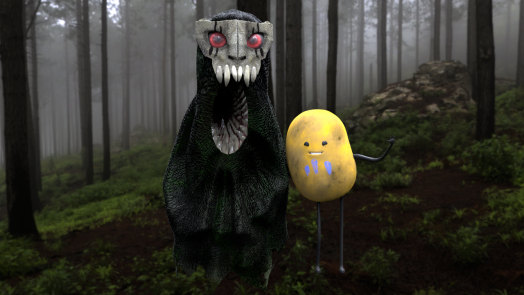
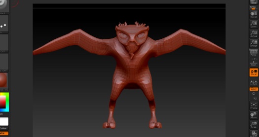
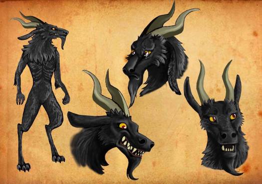
We really got a feel for the towering, slender scary black figure. So as I started out I did just that and my first drawing was very slender. The jet black creature to me, felt like he should be skeletal and lanky, to really create that sinister quality, However, I got feedback from the team that they wanted him to be more muscular and imposing. This was not feedback I really wanted to hear, however, I abandoned my previous designs and started working on a more muscular design.


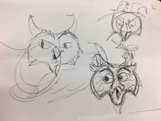
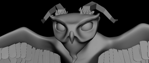
After that I worried that he was drifting to close to Beast from beauty and the beast (In particular the cloak didn’t help. These designs were worse than the ones before it and so we decided to try and really bring back the face design in an attempt to challenge it. I took it back again and drew up a page with a large variety of faces.


From here the team analysed the drawings, writing notes and picking out the elements they liked from each of the designs and I amalgamated them to create one face design.


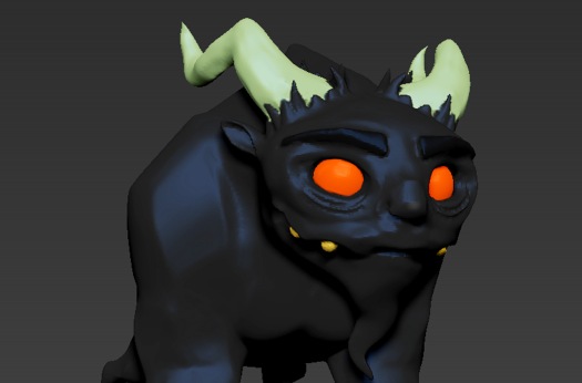
The combination of the favourite features of each of these designs lead to this colour design-

22119118_10214232820641633_91476660_n

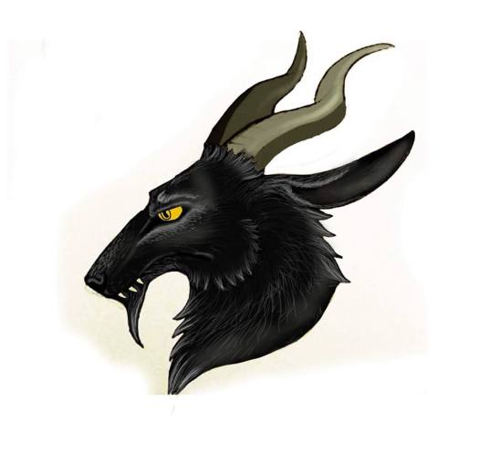
While looking at these I stumbled upon the Manga Totsukuni no Shoujo, which is about a small child who befriends a giant black creature. The illustrations are beautiful and give a really nice feel for what we could be looking for Puca. However, I’m really not into the suits and clothes the creature wears and wish to change the team’s mind about Puca needing a cloak.


(Totsukuni no Shoujo, Nagabe)

From here I began to zone in on the design and use ink to bring out some of the creepy black and white drawings that I had seen in the ‘Myth’s of Britian’ book, where I had initially seen about the Puca.


This slideshow requires JavaScript.

(Folklore and Myths of Britian, Russell Ash)

Using the beautiful lino prints and Ink sketches from the book as a reference I began some black and white ink sketches of my own, attempting to capture that eerie style.

This slideshow requires JavaScript.

ANATOMY RESEARCH

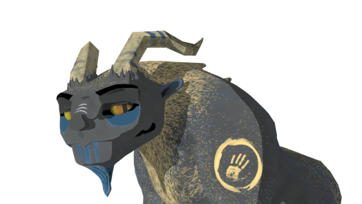
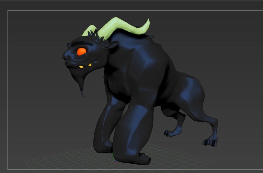
I then decided to experiment with a happier, friendlier style. For Anatomy I decided to follow Marshall Vandruff’s Gnoman workshop tutorial. I have owned a journal with a huge amount of his work within it and it is really brilliant for anatomy studies. We wanted to make him more animalistic and less human. Perhaps I’ll try some quadruped designs later, for now, let’s try give him a mix of human and creature anatomy. The ‘short-faced bear’ leg below is probably the closest we’ll get hind leg wise.

MVA01_stills_04

(https://www.thegnomonworkshop.com/tutorials/introduction-to-animal-anatomy)

Natasha was also kind enough to get me Terryl Whitlatch’s book ‘Principals of creature Design’

81dwh84PotL

The book not only depicts beautiful depictions illustrative animal anatomy it also provides guides and studies into the thought process required to design a species. The evolution of that species needs to be considered, how did it b ofecome the way that it is? This is something I need to consider for Puca. She also places an emphasis on the need for every part of the creature to have a purpose. He needs to be functional and practical within his own environment.

Terryl also speaks of the art of combining existing species and using mother nature as a reference when designing a new species. She often uses other species in her designs, merging them together so that the results are alien enough to be different while still being recognisable. Examples of this can be seem in the below illustrations.

This slideshow requires JavaScript.

keeping this in mind in terms of Puca the creatures I want to incorporate into his design are a Hare, Goat and wolf, as well as having some human characteristics.

22140612_10214232820361626_1546354126_o

And following that I looked at how he would look when he takes the form of a crow in our minisode.
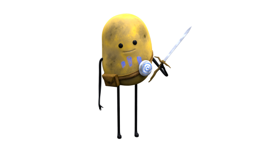
22197559_10214232819681609_1977918655_o


Tato


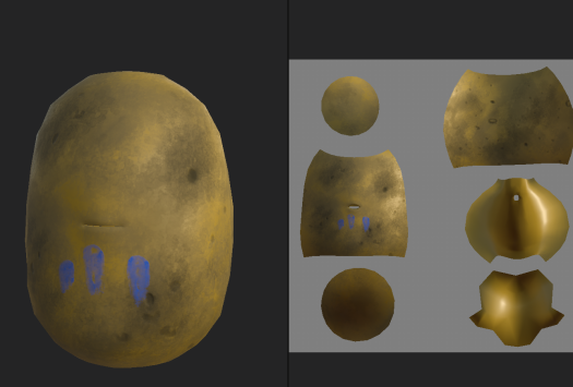
Andrew had the amazing idea that Nami’s little companion in the story should be a potato, due to the Irish steretype of loving spuds! We wanted to keep Tato’s design as simple and different from the others as possible. He shouldn’t be a complex creature but instead, he should have dot eyes and string limbs. I created this initial sketch for Tato. I created a pinterest board for us to reference. After my initial design, Andrew took it and really ran with it. He’s doing some pretty cool designs.

22155250_10214232820961641_1506552929_n

As Research for Tato’s Design, we have all been intriged by Blue Zoo’s animated short Avocado Man. This beautiful little short depicts a very similar design as what we are trying to accomplish with Tato. A basic round shape, stick man legs and dot eyes. He should be cute and delicate feeling.

Cassandra


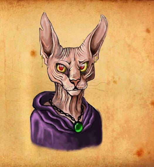
For our evil character in the story, we firstly spoke of her being a hairless or sphynx cat or something that resembles the old hag trope without directly being human.  I’m really not happy with the designs so far at all. Hopefully i’ll be able to bring them further. She is not really a finsihed character yet and so still comes across as being a little flat.


22093657_10214232820281624_259411353_n